Layout / UI
PostPosted:Sat Jul 30, 2011 7:15 am
Hello,
I ran into some problem with the UI that could probably be fixed with a slight change in the UI.
Today, there is the tree on the left, the list of files on the right and the Preview of the documents just under this list.
I am using the preview feature a lot and I end up scrolling a lot because:
- I move the splitter up to see the preview
- I move the splitter down because the context menu in the list gets hidden under the preview.
I think that having (maybe as an option) the preview panel (and properties and so on) on the right would be a good option.
Most of the documents (A4, Letter, etc...) are higher than they are wide. Moreover, today, most of the screen are 16/9 ratio or similar.
And finally, we loose lots of room today in the list with very empty wide column such as the version.
So I think changing the UI for 3 columns (tree, list, preview) would greatly improve the usability. For users with a dual screen, having to ability to detach the preview panel and bring it to the second screen would, I suppose, be a great improvement as well.
See below an example. I made le preview big and the context menu disappears UNDER the preview.
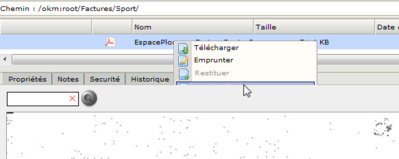 OpenKM - Google Chrome_2011-07-30_09-26-58.png (20.07 KiB) Viewed 2680 times
I ran into some problem with the UI that could probably be fixed with a slight change in the UI.
Today, there is the tree on the left, the list of files on the right and the Preview of the documents just under this list.
I am using the preview feature a lot and I end up scrolling a lot because:
- I move the splitter up to see the preview
- I move the splitter down because the context menu in the list gets hidden under the preview.
I think that having (maybe as an option) the preview panel (and properties and so on) on the right would be a good option.
Most of the documents (A4, Letter, etc...) are higher than they are wide. Moreover, today, most of the screen are 16/9 ratio or similar.
And finally, we loose lots of room today in the list with very empty wide column such as the version.
So I think changing the UI for 3 columns (tree, list, preview) would greatly improve the usability. For users with a dual screen, having to ability to detach the preview panel and bring it to the second screen would, I suppose, be a great improvement as well.
See below an example. I made le preview big and the context menu disappears UNDER the preview.